Hunter & Hyland are well-respected bespoke drapery hardware specialists who’ve been crafting bespoke curtain poles, finials, tracks and blinds since 1889. Based in Surrey, Hunter & Hyland utilise their experienced, traditional skills to create stunning, unique pieces.
Rebranding – Logo & Printed Materials
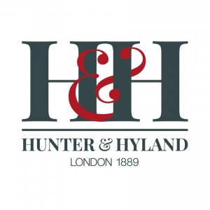
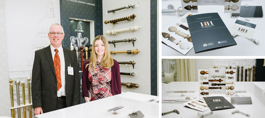
Austin Marketing were commissioned to undertake the rebranding of Hunter & Hyland’s visual identity, including their logo and colourscheme for use on their website, business cards, letterheads, promotional material and upcoming exhibition stand. We were also tasked with product photography for all of their printed materials.
One of Hunter & Hyland’s specific requests regarding the rebrand was that the logo design reflected Hunter & Hyland’s heritage of skilled craftsmanship. So, Austin Marketing worked through a series of design phases in liaison with Hunter & Hyland to decide upon a typeface and colourscheme which best portrayed the company as a classic, luxury brand.


In reflecting their heritage, we incorporated Hunter & Hyland’s location and date of establishment as well as a swatch of red into the new logo, retaining a link from their previous branding and history. The modern typeface selected for the new logo is derived from a design created in 1800s, resonating with their expansive history.
The directors of Hunter & Hyland are very impressed with Hunter & Hyland’s rebranding, expressing that it holds “a fresh, contemporary feel”.
Exhibition Stand Design
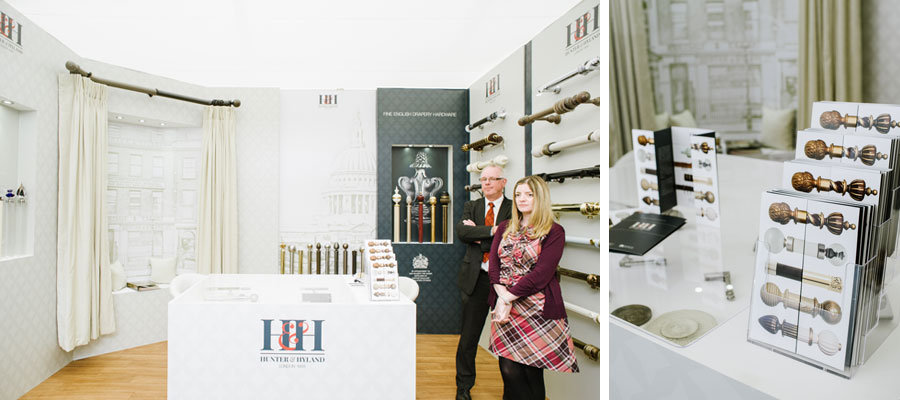
Hunter & Hyland were due to attend Decorex International 2015 – the industry’s largest supplier exhibition, and requested Austin Marketing design the layout and graphics for their 2015 stand. It would be the first time that Hunter & Hyland’s new branding would be revealed, so, we worked closely with our client to ensure their desires and requirements were exceeded. Austin Marketing also commissioned and managed the build, install and break down of the stand.

The design needed to incorporate one wall displaying 30 curtain poles, showcasing their variety of different pole designs. It also required a motorised bay pole window highlighting their specialised set of crafting skills. Taking these requirements into account, Austin Marketing worked through a selection of designs until Hunter & Hyland were happy with the proposal.
The exhibition stand, once installed to design, turned out exactly to plan and all were happy with the results, with the graphics and promotional materials drawing the Hunter & Hunter exhibiting space together to deliver the cohesive message they desired. The exhibition allowed Hunter & Hyland to re-connect with existing customers and showcase the breadth of their portfolio, as well as introducing their business to a whole new audience.
